Senin, 06 Februari 2012

Cara Edit Foto Jerawatan Jadi Super Mulus

How To Edit Photos Spotty So Super Smooth


Ina : 
untuk editan kali ini, pertama tama kamu buka gambar atau foto yang akan di edit. kalo saya pake gambar ini. mumpung ajah, gambar ini lagi kasasar di internet. hehe . . . .

Eng  : 

edits this time, you first open an image or images to be edited. if i use this picture. During,this picture again on the internet. hehe .....


Ina : 
trus, jangan lupa menggunakan duplikat layer(Ctrl+jpada gambar atau foto tsb. setelah itu, kamu blur menggunakan Gausian Blur, kira" radiusnya tinggi sampai jerawatnya yang keliatan, nggak nampak lagii ...
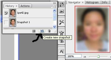
contohnya :
 radius 11.0
Kalo udah di blur dari pada History di klik 'CREATE NEW SNAPSHOOT' 


Eng : 
continue, do not forget to use a duplicate layer(Ctrl+j) on the image or photo page. after that, you use the Gaussian Blur , an estimated radius of plasticity higher up acne,not visible anymore ...
example :
radius 11.0
If already in the blur of the History, click the 'CREATE NEW SNAPSHOOT'

Ina : 
Udah kan ? ok setelah itu kita undo atau ‘CTRL+Z’ trus taruh sourch nya di snapshoot yang baru aja kita buat tadi ..

Udah ? kalo gitu Nah sekarang pakai tools yang bakalan kita pakai adalah ‘HISTORY BRUSH TOOL’
Trus ganti modenya yang ada diatas dengan ‘DARKEN’


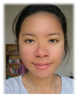
Kalau sudah , sapukan brushnya ke wajah sampe rata , tapi kamu harus ingat ! jangan sampai kena mata , lubang hidung , dan mulut . terus jangan sampe detail wajahnya menghilang . ok !


Trus kalo udah , ganti modenya dengan ‘LIGHTEN’


Sama , sapukan juga ke wajah kaya yang tadi , terus lihat bagaimana hasilnya 
intinya Main Darken dan Lighten 
pekerjaan anda .. sebagai pembanding sebelum dan sesudah diedit... 

Eng : 
Already right? ok after that we undo or 'CTRL + Zthen put it in snapshoot sourch that wejust had made ​​earlier ..
Already? Well if so is now going to use the tools that we use is 'HISTORY BRUSH TOOL'
Now change its mode as described above with the 'Darken'

If so, wipe the face until brushnya to mean, but you must remember! Do not contact with eyes, nostrils, and mouth. continue to do until details of his face disappeared. ok!

Then if already, change its mode to 'Lighten'

Together, brush also had to face the rich, continue to see how the results
Darken and Lighten Main point
your work .. as a comparison before and after editing ...


Ina : Gimana,, mudahkan...
         selamat mencoba... :)

Eng : How,, really...         good luck ... :)

Jumat, 03 Februari 2012

Dancer with a dynamic liquid splash effect.

Dancer dengan efek splash dinamis cair.


In this tutorial we'll create an image of a Dancer with a dynamic liquid splash effect.
(Dalam tutorial ini kita akan membuat gambar Dancer dengan efek splash dinamis cair.)


Eng : Here are the few images used:
Ina : Berikut adalah beberapa gambar yang digunakan :


Dancer: Image ID: 5826686 © Alexander Yakovlev 123RF.com
Liquid Splash: Image ID: 7311559 © ifong 123RF.com


Liquid Splash: Image ID: 7499033 © ifong 123RF.com


Spatter: Image ID: 4797910 © Ana De Sousa 123RF.com

Eng :
Preparing the splashes
Fire up Photoshop and open the Dancer and paint/liquid splash images that you want to use.
First the splash image. You will see that this layer is locked. let's make this a working layer by double clicking on it, and then selecting "OK" from the option box.
The layer name will be renamed from "Background" to "Layer 0".
Use the Magic Wand Tool (W) select the background of the splash, then hit delete.

Ina : 
Mempersiapkan percikan
Jalankan Photoshop dan membuka Dancer dan cat / gambar percikan cairan yang ingin Anda gunakan. Pertama gambar splash. Anda akan melihat bahwa lapisan ini terkunci. mari kita membuat layer bekerja dengan mengklik ganda di atasnya, dan kemudian memilih "OK" dari kotak pilihan. Nama layer akan berganti nama dari "Latar Belakang" untuk "Layer 0".Gunakan Magic Wand Tool (W) pilih latar belakang splash, lalu tekan hapus.


Eng : 

Use the Lasso Tool (L) to copy (Ctrl / Cmd + C) sections of the splash that you want to use (or if you want to use the whole splash as is, just invert the selection (Ctrl + Shift + I) after you delete the background), then paste (Ctrl / Cmd + P) it onto the Dancer image.

Try to look for sections of the clothing that will go well with the "flow" of the splash.
Lower the opacity for the splash so it's alot easier to see where you're placing it.
Use the Free Transform (Ctrl / Cmd + T) and/or Warp Tool (Edit > Transform > Warp) to shape it to the creases in the clothing. Return the splash opacity to 100%.


Ina : 
Gunakan Lasso Tool (L) untuk copy (Ctrl / Cmd + C) bagian-bagian percikan yang ingin Anda gunakan (atau jika Anda ingin menggunakan percikan keseluruhan sebagaimana adanya, hanya invert seleksi (Ctrl + Shift + I) setelah Anda menghapus latar belakang), kemudian tempel (Ctrl / Cmd + P) itu ke gambar Dancer. Cobalah untuk mencari bagian dari pakaian yang akan cocok dengan "aliran" dari splash. Turunkan opacity untuk splash jadi jauh lebih mudah untuk melihat di mana Anda menempatkannya. Gunakan Free Transform (Ctrl / Cmd + T) dan / atau Alat Warp (Edit> Transform> Warp) untuk membentuk ke dalam lipatan pakaian. Kembali opacity splash untuk 100%.


Eng : 

Apply a layer mask to the paint splash and remove main unwanted areas of it with a soft brush (0% hardness), then slowly blend the paint to the crease with alternating opacities and brush sizes.

I used mainly around 30%-10%.

Ina : 
oleskan lapisan masker ke percikan cat dan menghapus area yang tidak diinginkan utama itu dengan sikat lembut (0% kekerasan), kemudian perlahan-lahan menyatu cat dengan kerutan dengan bolak kekeruhan dan ukuran kuas.

saya menggunakan terutama sekitar 30% - 10%


Eng : 

Applying the splashes

Now here's the tricky part where I can't pin point how or what to do specifically. It's a whole trial and error process that also needs alot of observation.
Let's change and match the colors of the splash at best, according to the colors of the Dancer's clothes, where it is positioned
There are a few ways to do this, but I found the Gradient Map Tool works better and allows more control over the tones.
First, select the Dancer layer, and sample the color of the clothing near the blending point of the splash with the Eyedropper Tool (I).
Then select the Splash layer, got to Layer > New Adjustment Layer > Gradient Map.


Ina :  

Menerapkan Percikan

sekarang ini, merupakan bagian yang tersulit. dimana saya tidak bisa pin point bagaimana atau apa yang harus di lakukan secara khusus. ini adalah percobaan secara keseluruhan dan proses kesalahan yang perlu banyak observasi. mari kita ubah dan mencocokkan warna splash yang terbaik, sesuai dengan warna pakaian penari itu, di mana ia di posisikan. ada beberapa cara untuk melakukan ini, tapi saya menemukan Tool Peta Gradient bekerja lebih baik dan memungkinkan banyak kontrol terhadapnada.
pertama, pilih layer dancer, dan sampel warna pakaian dekat titik campuran dari splashnya dengan perangkat pipet(I). 
kemudian pilijh layer splash, mendapatkanke layer > baru penyesuaian layer > Peta Gradient


Eng : 
click " use previous layer to create clipping maks" clik ok, and click on the gradient map box to bring out the gradient editor.

ina : 
Klik "Gunakan Lapisan Sebelumnya Membuat Masker Kliping", klik OK, dan klik pada kotak peta gradien untuk membawa keluar Gradient Editor.
Add caption


Eng : 

You will see that by default, this gradient is called "Foreground to Background". the Foreground color being the one sampled from the Dancer's clothing.

Below it is the Gradient Bar, where we will manipulate the colors using the Color Stops - The left stop coresponding with the Shadows, the right stop with the Highlights.
That being so, for the end result you might want the left Color Stop at a darker tone of that specific color compared to the one on the right.
First, change the color of the right Color Stop by clicking it then selecting "Foreground" as well in the "Stops" option box. This changes its default color to that of the left Color Stop (Sampled color). After this, the gradient name will have changed to "Custom". This is the main color template that we will start with.

Ina :
 Anda akan melihat bahwa secara default, gradien ini disebut "Foreground to Background". warna Foreground menjadi satu sampel dari pakaian Penari itu.Di bawah ini adalah Bar Gradient, dimana kita akan memanipulasi warna menggunakan Warna Stop - Pemberhentian kiri coresponding dengan Shadows, berhenti tepat dengan Highlights.Bahwa menjadi demikian, untuk hasil akhir Anda mungkin ingin Stop Warna kiri di nada lebih gelap dari warna tertentu yang dibandingkan dengan yang di sebelah kanan.Pertama, mengubah warna Stop Warna kanan dengan mengkliknya kemudian memilih "Foreground" dan juga pada kotak pilihan "Stop". Hal ini akan mengubah warna default dengan yang Berhenti Warna kiri (warna Sampel). Setelah ini, nama gradien akan berubah menjadi "Custom". Ini adalah template warna utama yang kita akan mulai.


Eng : 
Bring up the Color Picker Box by double clicking the Color Stops. While refering to your splash image, alternate between Color Stops and cycle through the Color Field for tones that best match that part of the Dancer's clothing, and also the details of the Splash.

Ina : 
Memunculkan Kotak Color Picker dengan mengklik ganda Stop Warna. Sementara mengacu pada gambar splash Anda, bergantian antara Stop Warna dan siklus melalui Bidang Warna untuk nada yang paling cocok yang bagian dari pakaian Penari, dan juga rincian Splash.


Eng : 
You might also want to move the Color stops and Color Midpoint around to get a better result. Once you're happy with the result, click OK.

Ina : 
Anda mungkin juga ingin pindah berhenti Warna dan Warna Midpoint sekitar untuk mendapatkan hasil yang lebih baik. Setelah Anda puas dengan hasilnya, klik OK.


Eng : 
Click on the Splash layer and create another adjustment layer for Levels to tweak the exposure slightly, where needed.

Ina : 
Klik pada lapisan Splash dan menciptakan lapisan lain penyesuaian untuk eksposur Tingkat tweak sedikit, di mana diperlukan.


Eng : 
To keep the workflow more organized, create a new group folder and place the Splash image and its adjustment layers in there, then name it accordingly.


Ina : 
Untuk menjaga alur kerja lebih terorganisir, membuat folder grup baru dan menempatkan gambar Splash dan lapisan penyesuaian di sana, maka nama itu sesuai.


Eng : 
Repeating the steps, place a few more splashes around. I named all splashes individually and and arranged the group folders into the order preferred.

Ina : 
Mengulangi langkah-langkah, menempatkan percikan lagi sekitar. Aku bernama semua percikan individual dan dan mengatur folder grup ke dalam urutan yang lebih disukai.


Eng : 
Use the Layer Mask to remove any sections of the splash that are overlapping.

Ina : 
Gunakan Layer Mask untuk menghapus bagian-bagian percikan yang tumpang tindih.


Eng : 
When it looks good enough to you, flatten the image.
Use the Stamp Tool (S) with a light opacity to further blend the splashes to the clothing.

Ina : 
Ketika terlihat cukup baik untuk Anda, meratakan gambar.Gunakan Stamp Tool (S) dengan opacity ringan untuk lebih berbaur dengan percikan untuk pakaian.


Eng : 

Dodge and Burn, Highlights

We will intensify the shadows and highlights of the splashes. Other than using the Dodge and Burn Tools (O) directly on the image and damaging it's quality, let's do it the non-destructive way.
Hold down Alt / Opt and click the Create New Layer icon at the bottom of the Layers pallette.
Name the Layer "Dodge and Burn", set the layer mode to "Overlay" and also tick "Fill with Overlay-neutral color (50% gray)". Click OK and make sure that the layer is at the top.


Ina : 


Dodge dan Burn, Ikhtisar

Kami akan mengintensifkan bayangan dan highlights dari percikan. Selain menggunakan Dodge dan Alat Bakar (O) secara langsung pada gambar dan merusak kualitas itu, mari kita melakukannya dengan cara non-destruktif.Tekan Alt / Opt dan klik ikon Create New Layer di bagian bawah pallette Layers.Beri nama Layer "Dodge dan Burn", mengatur layer mode ke "Overlay" dan juga centang "Isi dengan Overlay netral warna (50% abu-abu)". Klik OK dan pastikan bahwa lapisan ini di bagian atas.


Eng : 
Decide where you want them, then use a white colored brush (B) and a black colored brush to dodge and burn respectively.

Ina : 
Tentukan di mana Anda ingin mereka, kemudian menggunakan kuas berwarna putih (B) dan sikat berwarna hitam untuk menghindari dan membakar masing-masing.


Eng : 
Create another new layer on top and use a white brush with opacities of around 30%-10% and brush along the contours of the splash according to the direction of the light source to create glows.

Ina : 
Buat layer baru di atas dan gunakan kuas putih dengan kekeruhan sekitar 30% -10% dan sikat sepanjang kontur splash sesuai dengan arah sumber cahaya untuk menciptakan bersinar.


Eng : 
If you think it's not smooth enough, you can use the Smudge Tool to soften the glow some more.

Brushes

Let's create some custom spatter brushes to give the splashes a "Burst" effect.
Open up an image of paint splatters. One with a plain background works best.
Use the Lasso Tool (L) and draw a selection around the area of the spatter that you would like to use as your brush.


Ina : 
Jika Anda pikir itu tidak cukup halus, Anda dapat menggunakan Smudge Tool untuk melunakkan nyala lagi.

BrushesMari kita membuat beberapa sikat memerciki kustom untuk memberikan percikan sebuah "Burst" efek.Buka gambar Splatters cat. Satu dengan latar belakang polos yang terbaik.Gunakan Lasso Tool (L) dan menarik pilihan sekitar kawasan hujan rintik-rintik yang Anda ingin gunakan sebagai kuas.


Eng : 
Go to Edit > Define Brush Preset and give your new brush a name. Save it, and you will see the brush at the bottom of your drop down brush menu.

Ina : 
Pergi ke Edit> Define Brush Preset dan memberikan sikat baru Anda nama. Simpan itu, dan Anda akan melihat kuas di bagian bawah drop-down menu kuas.


Eng : 
Create a few more different brushes, sample the color of the clothing or splash where you want to place it and click around that area. And here's the final version.

Ina : 
Buat kuas lebih berbeda, sampel warna pakaian atau splash di mana Anda ingin menempatkannya dan klik di daerah itu. Dan inilah versi final.


Eng :  that are lacking or do not understand,,
           please leave a comment .............
ina :    kalau masih kurang atau belum mengerti,,
           silakan tinggalkan komentarnya .............